This guide will walk you through the basics of using the Form Question Editor. You may have been directed to this article in the course of reading another Knowledge Base article on creating a membership application, survey, or another kind of form. The contents of this article will concern only the Form Question Editor itself; for details on initially creating the form, naming it, and adding it to a membership application or survey, please continue reading whichever Knowledge Base article directed you here.
Generally, the Form Question Editor is accessed by clicking a button labelled ‘Launch Form Question Editor‘, which will cause the interface to open.
The Form Question Editor Interface
You’ll find yourself in a screen that looks like the following:
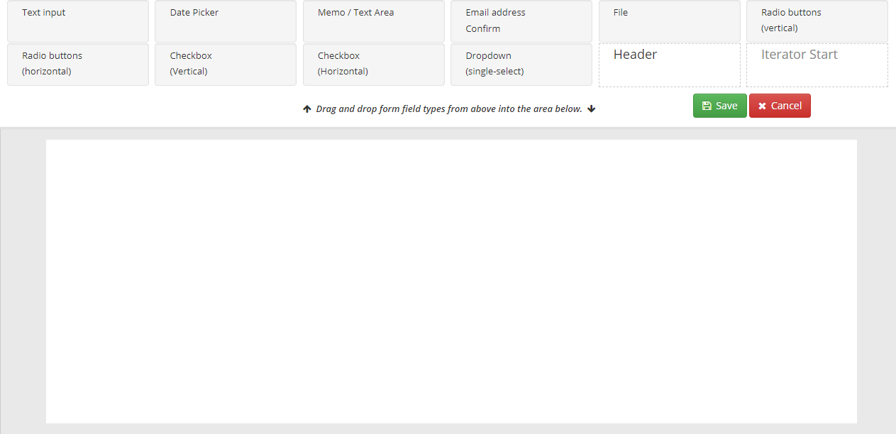
The top section contains a number of modules that can be clicked and dragged to the white workspace below in order to create various kinds of fields: text entry, file upload buttons, checkboxes, and more. For instance, here’s what the ‘Checkbox (Horizontal)‘ module looks like once it is dragged to the workspace.
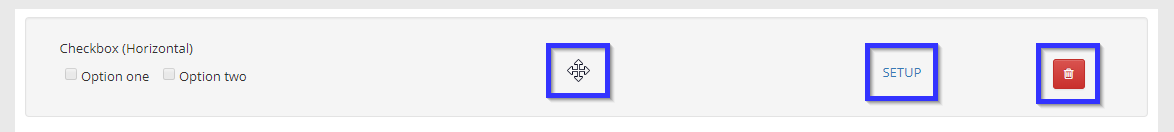
We’ve added the blue box to emphasize three important features of each module. From left to right:
- Click-and-drag cursor
- Setup
- Delete
Your mouse cursor will look like this four-way arrow any time you are hovering somewhere that will allow you to move the module. Clicking and dragging the module while your cursor looks like this will allow you to change the order in which your form questions appear by dragging the module above or below another.
The red trash bin icon will only appear when you are hovering over a module. Click it to delete the form question. Be cautious: there is no confirmation dialogue, so the form question will be deleted instantly.
Universal Setup Options
There are two settings that are common to every module; they will show up upon clicking the ‘Setup‘ button:
- Alias
- Required? toggle
The alias is an optional field that allows you to assign this module a name that only you will be able to see; this can be useful for keeping track of your modules or being able to guide another administrator in editing the form.
This toggle button will allow you to decide whether this question must be answered before the user can submit the form. If the button is in the left position and is green in colour, then the user will not be able to submit the form if the question has not been answered. If it is in the right position and appears red, then the user will be able to submit the form without answering it.
Continue reading in order to learn how to use each of the modules.
Module Guides
Text Input
Use this module when you would like to create a single-line text field for very short answers. The only setup option, besides the two universal ones, is a text field that will allow you to enter the label the user will see on the question.
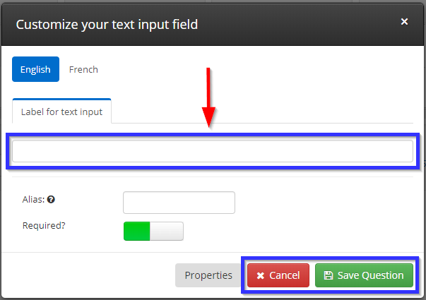
Click ‘Cancel‘ to stop editing the question without saving, or click ‘Save Question‘ to save your question and continue.
Date Picker
Use this module to allow the user to enter a date. This module works the same as Text Input: if you want to allow the user to enter a date range, like a start and end date, you must add two separate Date Picker fields.
Memo / Text Area
This module is very similar to the Text Input module; the only difference is on the form user’s side: the form will include a much larger text field in which the user can enter their response.
Email Address – Confirm
This module works the same as the Text Input module as far as configuring it goes. However, even if you don’t enter a text description for the user to see, they will still read ‘Email Address’ and ‘Confirm’ above the two single-line text fields this module will create. The two fields must match for the user to be able to submit an answer for this question.
File
This module allows the user to upload a file from their computer; setting it up involves setting a few more options than anything you’ve done yet so far in this guide.
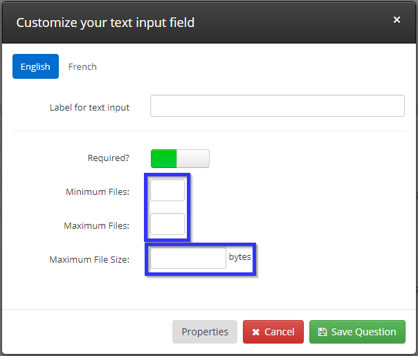
Aside from a few familiar options covered earlier in this page (see ‘Text Input‘), there are three new fields: ‘Minimum Files‘ and ‘Maximum Files‘ allow you to set the lowest and highest number of files a user can upload while filling out the form, and ‘Maximum File Size‘ allows you to set the maximum total file size a user can upload. This last field is measured in bytes, which are often represented as a capital ‘B’ in computer operating systems. You will rarely see it on its own; most files your users will deal with will be measured in ‘KB’ or ‘kilobytes’, which are approximately one thousand bytes, or ‘MB’, which are approximately one million bytes. For instance, if you’d like to cap the upload size at 3 MB, you’d enter ‘3000000’ in this field.
Radio Buttons
There are two versions of this module: vertical and horizontal. Either one will present the user with a number of options that are displayed alongside each other, and the user will only be able to pick one of those options: use one of these modules when you would like to create a multiple-choice question.
Choose the module that represents the way you’d like the options laid out on the page — that is, a vertical column running up and down or a horizontal row running left to right. Once you have decided on your desired layout and dragged the corresponding module into your workspace, click ‘Setup‘ to create your question.
You’ll notice a few new options not seen in any of the previous modules:
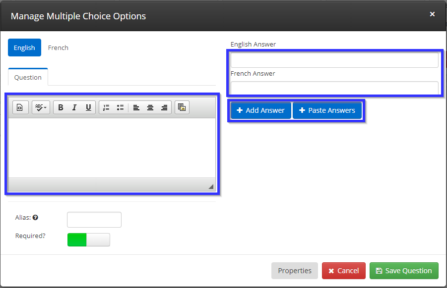
The box under ‘Question’ is a text editor that allows you to enter the question that the user will be expected to answer. On the right are a number of options for adding questions: entering an answer into the text boxes and clicking ‘Add Answer‘ will create a new choice.
If you wish to add multiple answers at once, or to paste in answers from another source, click ‘Paste Answer‘ to trigger the following view:
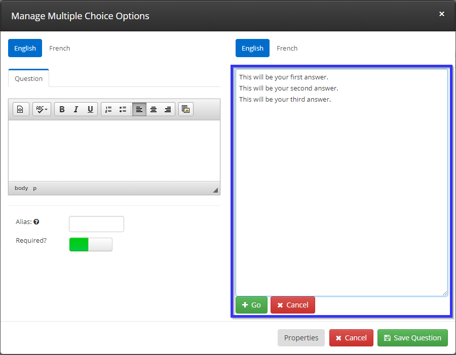
Any text entered in this text box will be converted into answers when you click ‘Go‘. Separating text with a line break — that is, hitting the Enter key — will trigger the creation of multiple answers: in the above example, three new answers would be added, and clicking ‘Go‘ would produce the following result:
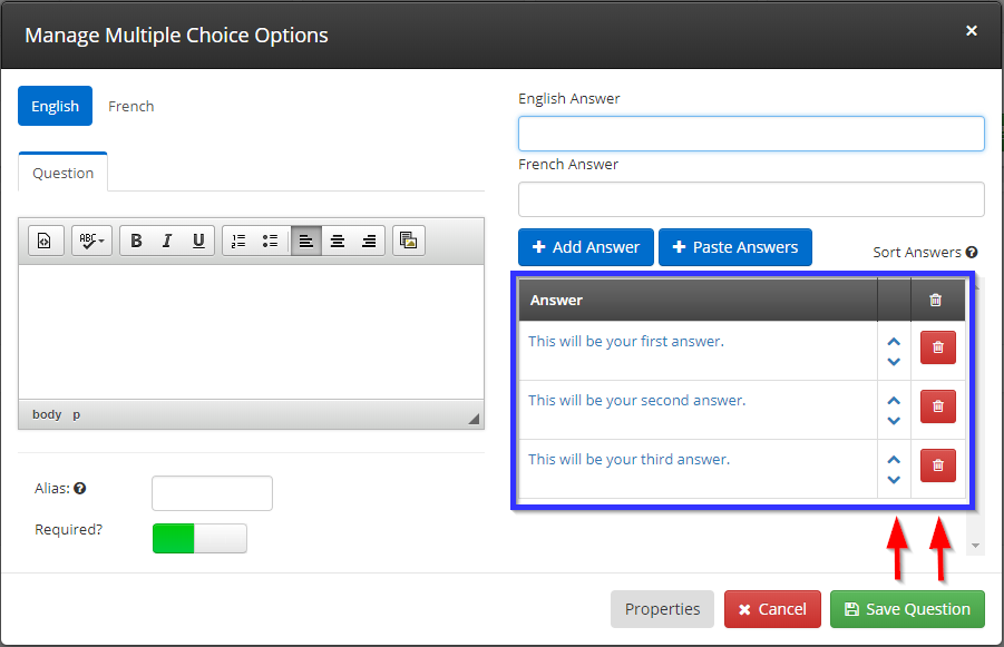
Once you have added all of the answer you would like, click ‘Save Question‘.
Checkbox
This module is appropriate when you would like to offer the user multiple options and the ability to pick more than one of these options. Setting up a checkbox question works identically to setting up a radio button question; the only difference is the functionality that the user experiences. See the previous section for details on setting up a checkbox question.
Dropdown
This module allows you to create a drop-down menu that will offer the user multiple options that are only visible once the menu has been clicked. This is useful when you are offering the user a large list of options that would take up an excessive amount of space when displayed simultaneously, like choosing a country of origin. Setting up a dropdown question works identically to setting up radio buttons; see that section for setup details.
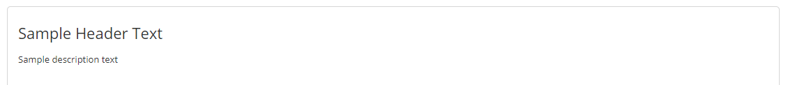
Header
This module allows you to enter text that will be displayed in the form of a large-print header and a smaller-print text block below. For instance, the following submission to the Form Editor will result in the module resembling the image after it:
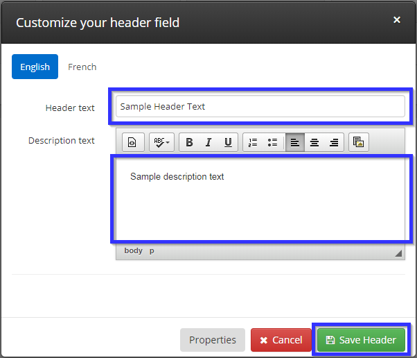
Resulting module:
Iterator
This module is useful when you wish to allow the user to fill in one or multiple modules as a set, for a number of repetitions that you may choose. When you initially drag it down, it will appear in two parts: ‘Iterator Start‘ and ‘Iterator End‘.
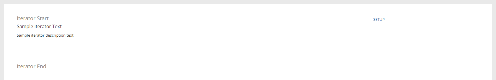
Clicking the ‘Setup‘ button will reveal a new option unique to this module.
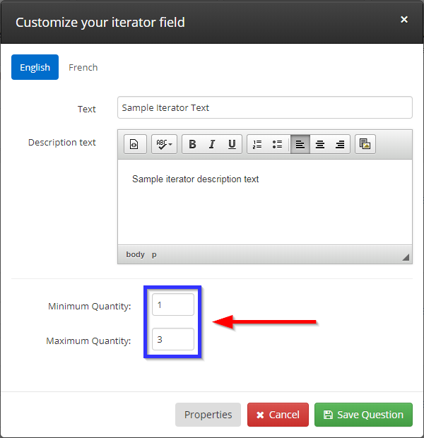
Other modules can be dragged between these two to create a repeating unit, and the indicated minimum and maximum quantity are the number of times the form user can submit this set. Below is one example in which two text input modules and a date picker module have been added.
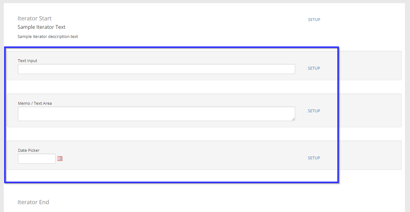
Combining this entry with the settings above means that the user would be given the opportunity to submit a short text answer, a long text answer, and a date as one set, and the user could choose to submit this set between one and three times.
Saving Your Form
1. At the top right corner, click the ‘Save‘ button.
2. Ensure that you click ‘Publish‘ in the context where you are adding this form, whether it is applying it to an event or a membership application.
Congratulations, you now have everything you need to use the Form Question Editor!